This redesign tackles Apple News's tendency to prioritize daily headlines and personalized snippets, making it hard to form a concise, multidimensional view of a single topic including broader context. This redesign groups content into discrete topics, offers tailored exploration via article recommendations sorted by topic and source type, integrates an in-app chat for follow-up questions and personalized guidance, and lets users follow unlimited topics while viewing a "coverage profile" that highlights their biases and suggests ways to diversify their perspective. This project was initiated in Stanford's CS 247A (Design for AI) class and follows the RITE method (Rapid Iterative Testing and Evaluation) and makes use of [Microsoft's HAX toolkit and playbook for Human-AI Interaction.
Project Progression
We created a Product Requirements Doc (PRD), outlining the following:
- target audience
- user needs
- scenarios including sunny day scenarios, stress cases, possible failure states
- relevant AI guideleines
- required data and features
- comparators
- stakeholders
View the whole PRD here for the full outline.
Ideation
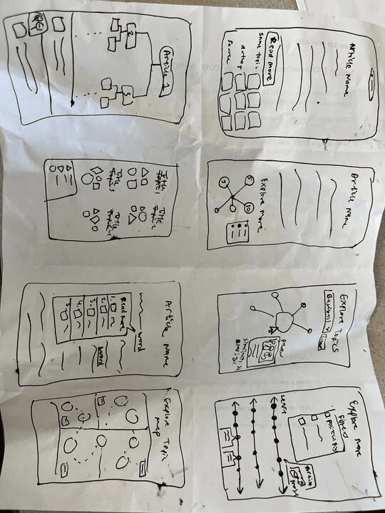
We used the Crazy 8s brainstorming method to quickly sketch out ideas (8 sketches in 5 minutes).
RITE Testing Plan
To iterate on our designs, we used the RITE testing method with incorporation of A/B testing. We ran four different stages of testing involving a total of 8 participants. During each testing phase, users were asked to use the "think aloud" approach, verbally narrating their observations and critiques.
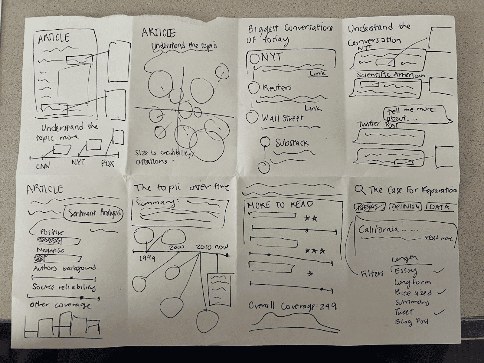
We first created lo-fi sketches that focused more directly on our final concept. Testing questions in this stage mostly focused on evaluating user interest in the overall concept and understanding of the layout of our redesigned topic and chat pages.
The second iteration involved designing grayscale interfaces with a focus on testing ease of navigation from one screen to the next. We avoid color at this stage to ensure design critiques were more focused on organization questions, rather than aesthetics.
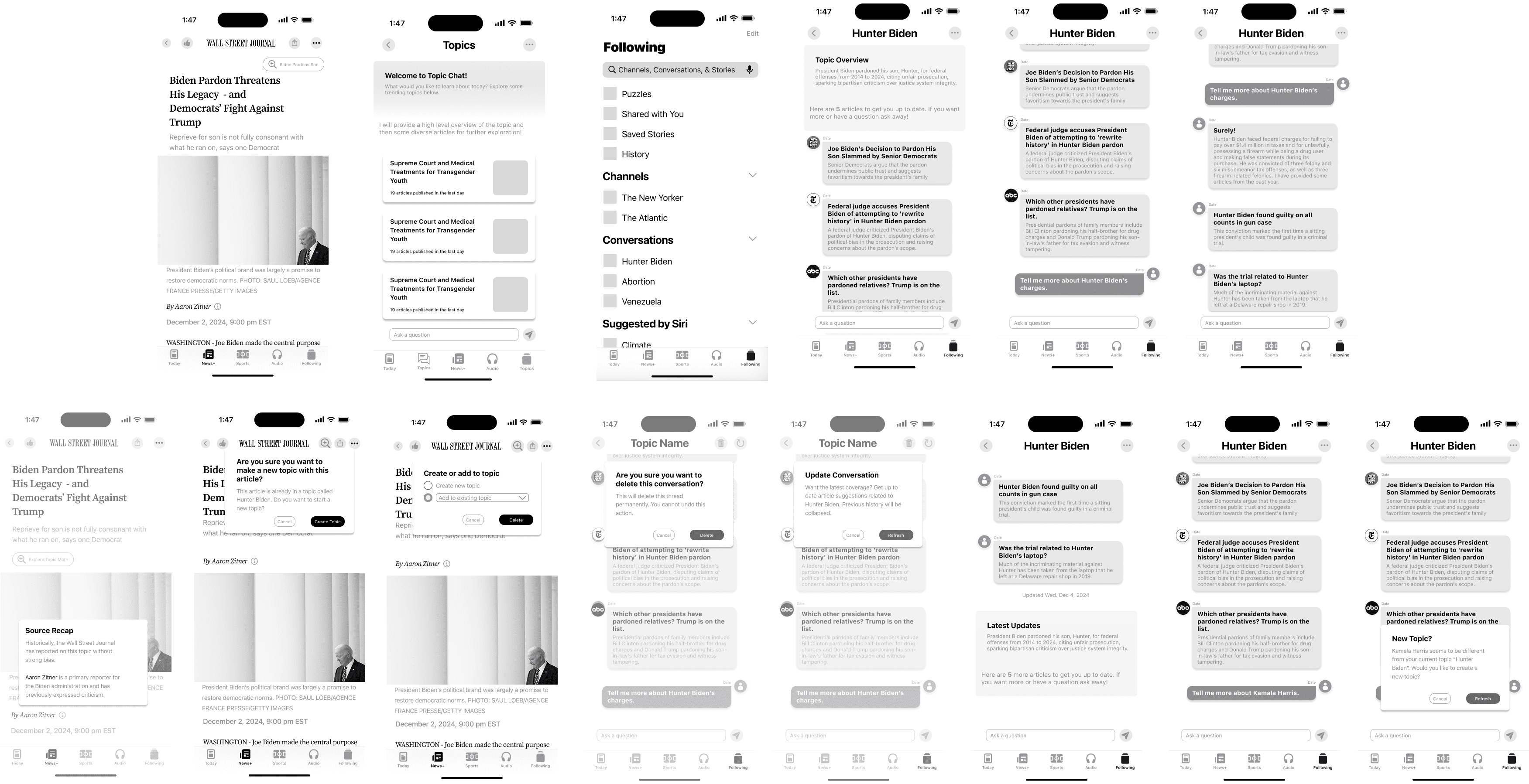
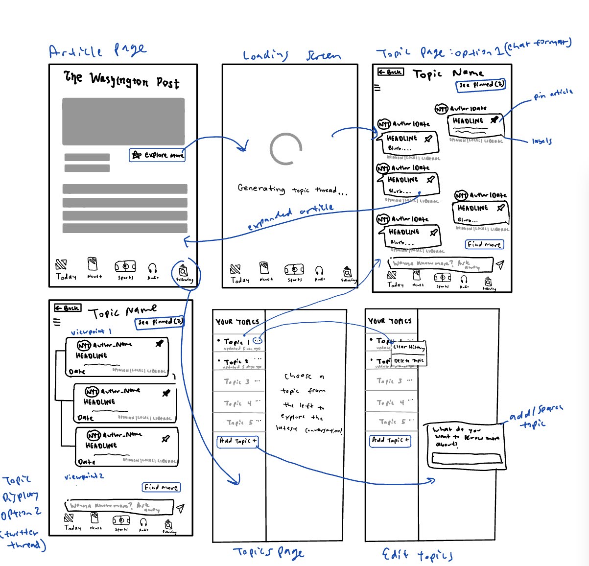
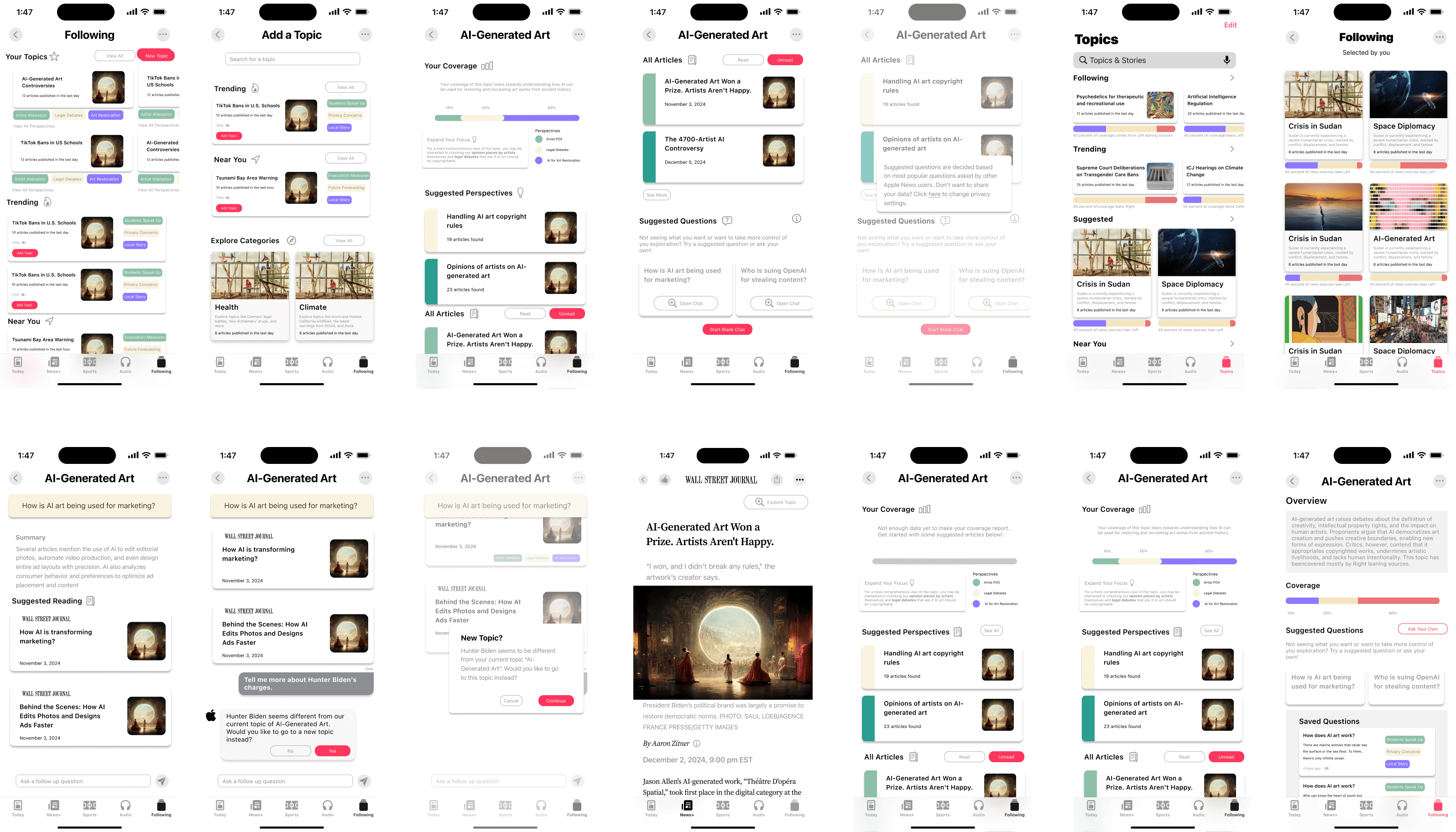
The third iteration involved a significant pivot from our previous chat-focused designs, incorporating additional pages for displaying topics, showing a reader's coverage of an issue, diverse sources beyond traditional news outlets, and more.
We made heavy use of Figma's components and variants feature to rapidly iterate and create multiple options for A/B testing.
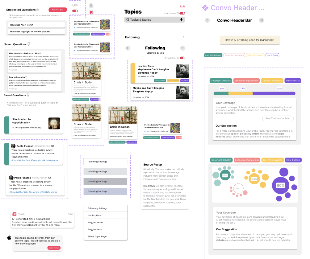
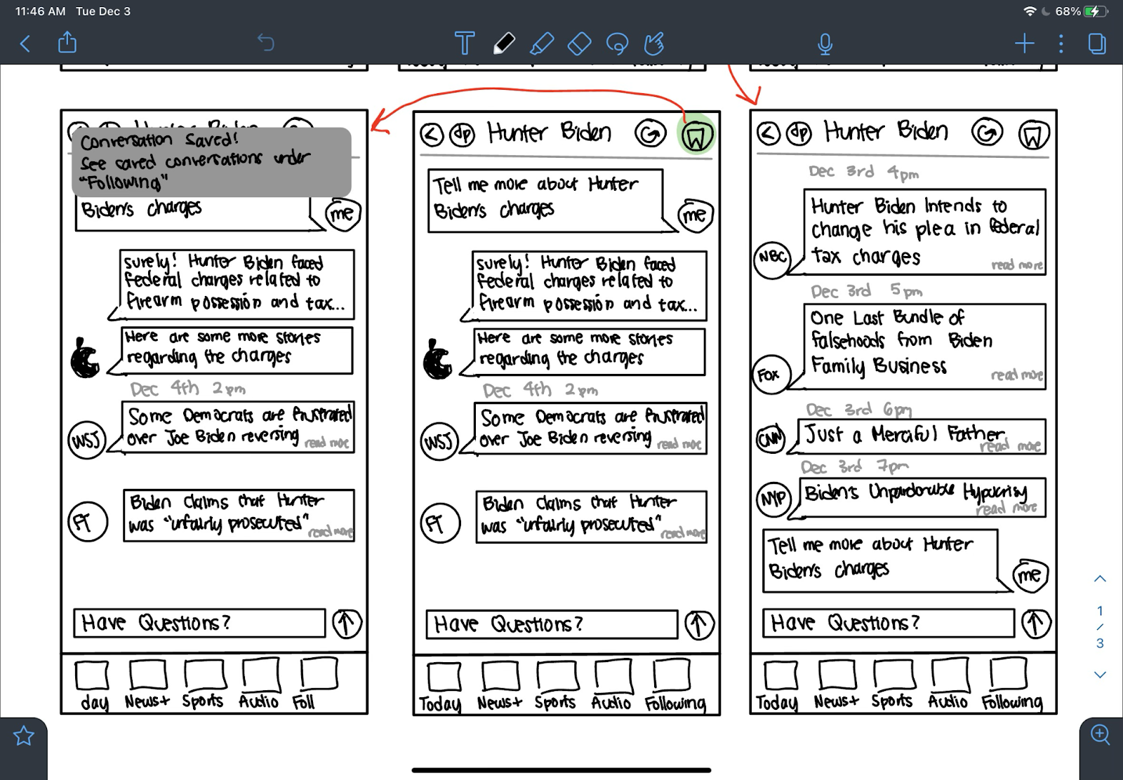
The final stage focused on scoping out a functional, interactive protoype. Testing was still done at this stage to gauge improvements for the future. Check out the final Figma prototype here.